Commercial Portfolios
Elxr Productions is a freelance business of mine. To date I have been responsible for designing and developing all the websites on this showcase.
Yodel Services was a commercial branch of QUT Creative Industries that I was Lead Project Manager for as well as strongly influencied the UI and feature development of this original Content Management System. I also led the UX and client delivery process through all the sites on this showcase.
UI/UX Design
Evolution of a Website Search
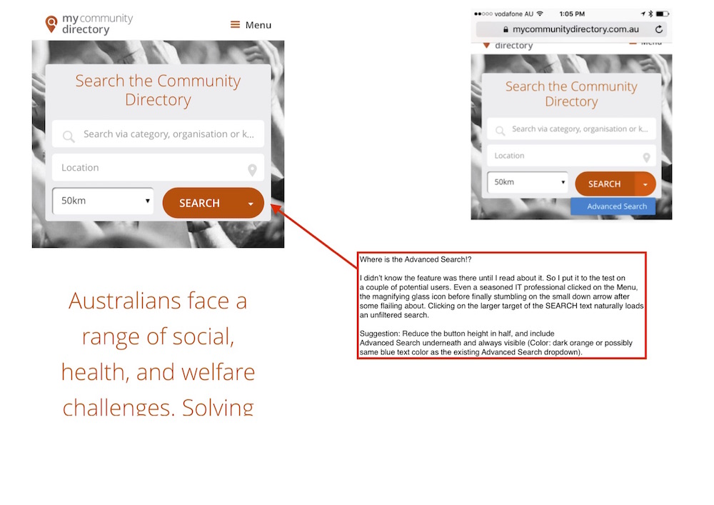
A new Advanced Search feature was added to a long standing Search area UI for this community directory website. The biggest problem was that most people would miss it if they didn’t know it was there. Here is an example of my initial feedback to the development team.
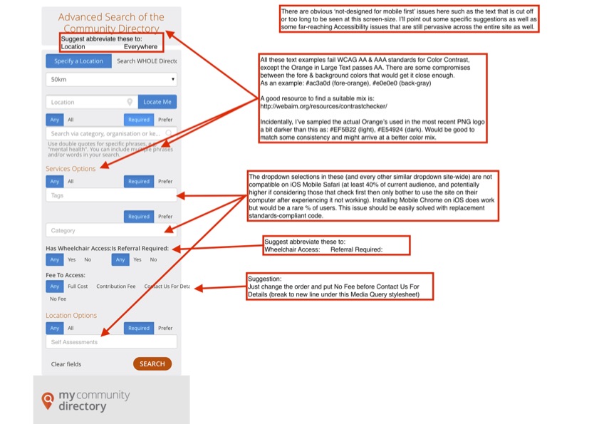
Variation 1
To eliminate some redundancy in ‘community directory’ (header, title bar) I reduced it to just Search – consequently Advanced Search could be used on that following page.
My initial suggestion of adding some small blue ‘Advanced Search’ text underneath still had the same issue of a very small target to click on (even if you know it’s there!), so I tried:
- Shortening the Location field to half length and shifting the related Radius field right next to it.
- Making 2 nice big buttons for each search option.
Result: Overall this tightened up the whole search area a bit and eliminated the unpredictable word-wrapping.

Variation 2
I think it’s important to try the extreme end and settle on a comfortable place in between. It’s pretty obvious this is a search area. To some degree, the title implied it was the Search page but it’s actually the landing page with other purposes. So I:
- Removed the title altogether
- Restored Location to it’s full length
- Added a distinct but slimmer blue Advanced Search button underneath that is still plenty big enough for big thumbs.
Result: I think it looks quite clear where everything is and it’s purpose. This also tightened up the whole search area significantly, allowing another line of the quotation below it.

University Student Portal Makeover
For QUT’s Doorway to Research site, I took a 5 year old design and cleaned up the UI with more modern sensibilities while avoiding confusing existing users:
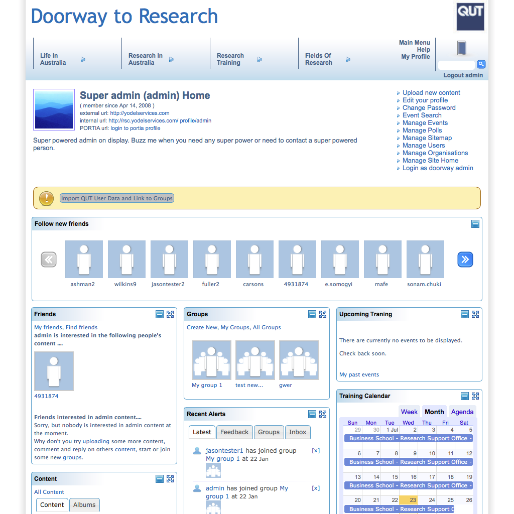
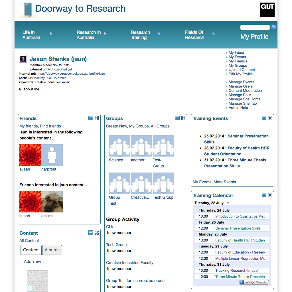
From Wireframe to Final Product
QUT: MOOCs
For a new MOOC (Massive Online Learning Courses) program at QUT, one of the initial pieces I was tasked with was putting together the top-level pages for the course info. It had to confirm explicitly to the university’s corporate template and there was no staging server. After content had been approved, I used the live prototyping software MACAW to create this live mockup of the 3 pages.
QUT: Arts POP
The following series of PDFs demonstrate my collaboration with a graphic designer through the entire process of Wireframing to Mockups to Final product for the Arts-POP site for Queensland University of Technology:
- Wireframes Phase 1 – Based on my discussions with stakeholders and coupling this with the feature set I proposed, I drafted up this initial set of Wireframes.
- Style Board Top Pick – this was the design style the team picked and we ended up using elements of this in the final product.
- Mockups Phase 1 – based off the designer’s style board, I turned my original wireframes into more of a mockup.
- Mockups Phase 2 – after some further design work by the graphic designer, this was the final mockups presented to the stakeholders.
- Mockups Phase 2 (Smartphone) – also final mockups, these I tailoring as best as possible within confines of a static page to replicate the responsive ‘smartphone’ layout that would eventuate.
- Final Design Guide – after several rounds between the designer, development team and myself, we settled on this final design guide for the home page, the remainder of the site would follow these styles.
- Arts-POP Website – the final site can be seen here which I was predominantly responsible for the front-end design code.
Logo Rebranding
Localising the My Community Directory logo. This was already a clean design that captured at least the location aspect of an online directory. Some needs arised where the logo in social profiles needed to identify which regional branch the profile was on. Instead of cluttering the design with extraneous text or images I settled on creating these variations for each Australian state based on loosely-official state colours.
![]()
e-Learning Slide development
While developing course material for a Robotics MOOC at QUT, a major element of my work was bringing clarity to content presentation. Here are some before and after shots.


Programming Examples
Please visit my GitHub page for some of my recent coding adventures.
Debugging
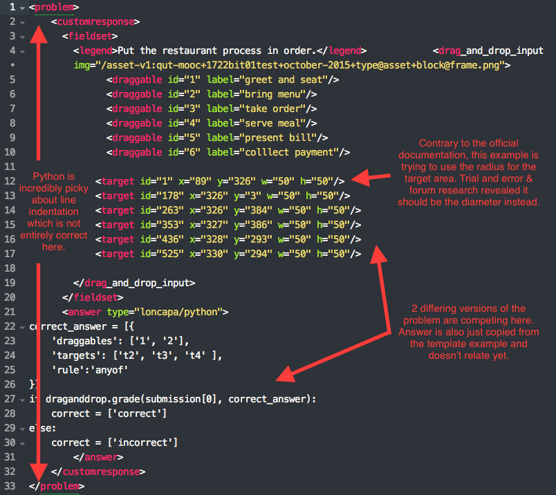
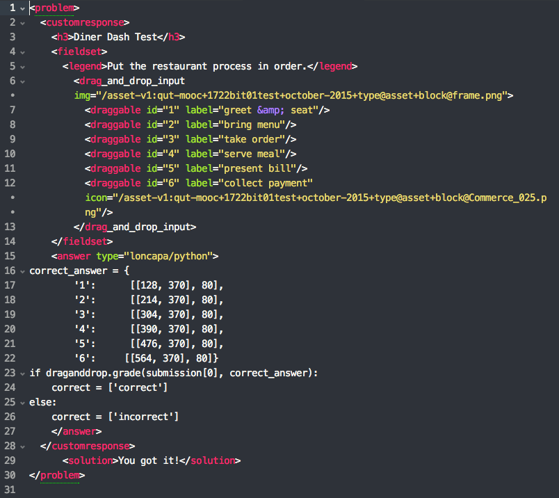
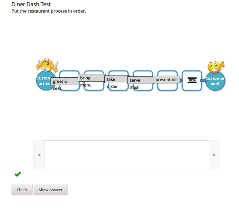
A most common task in any programming is troubleshooting why it is not working. As much of my work to date involves using code libraries & frameworks, and modelling solutions from templates of features already built in to various CMSs, I have developed a keen eye for spotting syntax issues that vary from language to language, and utilising any resources applicable from: official documentation, related forums, program language guides, and often just trial and error. This example illustrates some non-working code I was presented, some of the process I went through to fix it and the working proof-of-concept.